
Using Notifications for More Proactive Dashboards
You can help your dashboard users find the information they need quickly and efficiently by building in notifications.
As a business intelligence professional for over 20 years, I often ask myself why we create the solutions we do. The answer is, invariably, to aid our clients in making business decisions. Dashboards are a great tool for decision guidance but too often their design makes it hard for everyday users to get the information they need to make decisions and take action.
When we add a visualization to a dashboard, we usually have a specific user goal in mind, such as spotting an outlier or highlighting a trend that requires attention. Although we show all the slices or time periods, most of them don’t matter with respect to making decisions; all we really want the user to see are the exceptions. Often we even highlight the exceptions to make them easier to spot.
We trust the user to be savvy enough to make the connection from data-driven visual cue to insight to decision to action. When our audience is made up of analysts or executives, this trust is often rewarded and users can make these analytical leaps. However, what happens when our users aren't as sophisticated or perhaps don't have time to analyze a dashboard?
More Direct Than Charts: Notifications
In that case, it’s better to take a direct approach by telling users in simple, direct language (aka “plain English”) what to focus on. One way to do this is to embed smartphone-like notifications on the dashboard itself. We're already accustomed to consuming information in this way in our everyday lives. The paradigm is simple: users receive a text notification specific to their sphere of responsibility, which includes supporting data, and if applicable, a link to a resource that could mitigate the issue or complete the task. The idea is to show the user the exact information needed to perform the required action -- and nothing more. Executing this successfully requires back-end work to generate and categorize the notifications, and likely some gymnastics on the front-end business intelligence (BI) tool to render that data effectively.
How Notifications Work Behind the Scenes
On the back end, you must create a table or view to house the notifications. This structure will be fed by multiple queries or processes, each supporting a different type of alert or notification. Each of these child processes must create a data set of notifications according to business rules and pre-determined filtering that identifies a situation that management needs the user to be aware of.
Each notification will contain identifying user or organizational information the BI tool will use to present only the notifications relevant to a specific user or group. The notification data will contain all the text (names, descriptions, supporting data labels and values, parameterized URLs, etc.) needed for rendering in the BI tool. The system should be structured so it’s easy to add or change a notification without affecting the others or requiring alterations on the front end. The ability to be agile in creating new notifications as quickly as an analyst can write a query -- without changing an entire dashboard -- is one of the greatest advantages of a notification system.
Front-end Considerations
The next step is to render the notifications on the front end. The exact method depends on the BI tool. The goal is to generate a rich, text-based visual display and have each subsequent notification repeat vertically. This is easier said than done and will likely look different depending on the tool. The key is to make every component abstract and data-driven, including field headers, data labels, tooltips, and URLs . This allows each notification to be structurally identical (for the benefit of the BI tool) while providing contextually relevant data regardless of the content.
Example Use Case: Retail Store Management
How does all this look in practice? Imagine a hypothetical retail store manager. She comes in every morning and reviews a dashboard with visualizations about employee scheduling, inventory, and sales for her store. With a thousand things to do before customers arrive, she doesn’t have time to figure out what she needs to order or if employee coverage is adequate for the week. She just needs to see the issues in her areas of responsibility in a concise and actionable way.
Here's a snapshot of how a typical day's notifications might look:
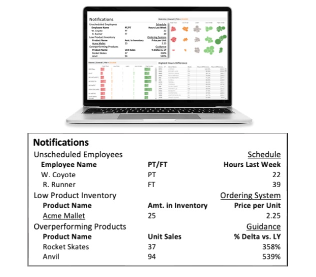
She’s presented with five notifications of three distinct types. Each type determines what supporting information is shown, how it’s labeled, and the data displayed. In this case, every character in this notification system is data-driven, including the links indicated by the underlines and the tooltips which (if visible) would contain prescriptive information. The notification data should include contextual labels for the detail field (shown here as Employee Name and Product Name) and the supporting information (including “PT/FT” and “Price per Unit”).
The information is hierarchical, with a single notification type potentially having more than one instance, shown here with the Unscheduled Employees and Overperforming Products notifications.
There are links -- both at the notification level (for the scheduling and ordering systems), and at the individual item level (Acme Mallet -- that send the user to a page where she can order that product.
The third notification (Overperforming Products) is not necessarily an issue, just something that management wants her to be aware of. The Guidance link here might take her to a document detailing how to get ahead of unexpected demand.
Imagine you are this store manager. You start your day by viewing your dashboard, where you’re presented with a concise list of the problems you need to address and the means to solve them in a single click. It’s basically a morning punch list. Think about how long it would take the manager, not necessarily analytically savvy, to obtain this same information from a densely populated dashboard. If we expect people to manage via exceptions, why are we showing them everything and making them hunt for the outliers?
Empowering the Right Users with the Right Information
It’s important to note that this type of solution isn’t perfect for every organization or application. It’s most effective when the dashboard returns only data relevant to each user’s sphere of responsibility. It’s more effective when the users are accustomed to receiving direction from management about how to do their jobs. It’s perfect for the type of user whose primary responsibility is something other than staring at a screen.
With the right user base and situation, adding notifications to your dashboard can save your users time and direct their focus to the issues that need their attention most.
About the Author
Josh Levy is a senior manager and dashboard development specialization lead with Aspirent Consulting. Josh has extensive experience crafting innovative business intelligence solutions for a variety of clients across industry verticals. Josh is now focused on bringing his energy and expertise to bear for Aspirent’s clients as well as mentoring colleagues in the art and science of dashboard development. Josh can be reached via email.