
Data Stories: Voting Infographic, UK Voting Rates, Politics by Color
Tracking the status of U.S. voting options, exploring statistics from the U.K., and how satellite imagery mirrors the political spectrum.
- By Upside Staff
- September 16, 2020
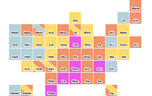
FiveThirtyEight regularly updates this infographic that shows the status of vote-by-mail options across the United States.

After last year’s election in the U.K., Power Compare (a website that helps consumers evaluate energy options) created this map that shows where more people didn’t vote than voted for any major party.
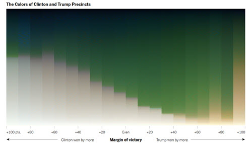
This recent visualization by The New York Times shows how the urban-rural divide in U.S. politics is also reflected in the average color of satellite imagery.