
Data Stories: Data Generation, Website Growth, Digital Transformation
Data visualizations help us think about how much data is being created, how popular the biggest websites are, and what the future of data looks like.
- By Upside Staff
- September 9, 2020
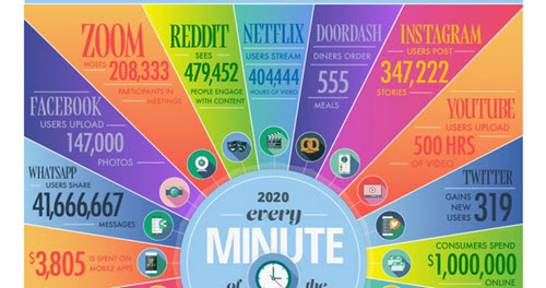
This graphic from Domo shows how much data and activity happens every minute online.
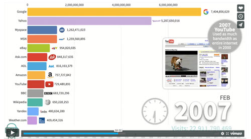
This video animates a visualization that shows how the ranking of the most popular websites has changed from 1993 to 2020.

This infographic is part of the Cisco Annual Internet Report, and it projects major growth areas in online activity over the next three years.